

Visualizing multi-player simulation rules
I've been largely an outside observer to our Country X project. CountryX is a simulation used for International Policy students studying what scenarios lead to genocide. In the early stages, the rules of the 'game.' converged on:
1. Four players, each in a specified role, starting with a watershed moment in an imaginary country.
2. The four roles are President, First-world Envoy, Regional Representative, and an Opposition Leader. (I immediately abbreviated these in my notes to 'P','E','R','O')
3. The game has four turns. In each turn, each of the four players decides on a context-specific list of three choices for their particular role. This is like playing a 'trick' in Bridge or Hearts.
When I first heard of the project, Jonah was working with the others on the project to specify the rules, for all of the contexts, in each of the states. He described an elaborate forest of paper Mark, our client, had on the walls of his office. How were we the programmers going to get him to describe the rules?
The problem is that most rule-making devices, besides pure programming code, already have a domain and the conceptual framework of how outcomes result. That is, we can narrow the possibilities of an outcome based on some global rules or variables, which the author can specify. But we did not know the framework yet.
So every turn had 3*3*3*3=81 (four players, three choices each) possible outcomes. This would diverge into a set of states for the next turn, and then for EACH state, 81 combinations would then diverge into the possible states for the next turn.
I understand my first contribution, as suggesting that if there were no general rules, then the only choice was to give him a truth table of 81 rows, each listing the state of that combination for the players. Eventually, it turned out that there were 28 states (with 8 on the last turn), so poor Mark had to fill in 81*20=1620 rows.
Impressively, Mark came through, and brought order to the possible outcomes (one of them genocide). Then Susan Dreher wowed us all with one of her first contributions to CCNMTL as bringing Mark's rules into a data model and environment for the game to be played.
What were all of these rules though? We know they had been specified, but it was a gloss of 1620 rows. In the data, you can see some notes Mark makes along the margins, to keep some of it straight himself. But as outsiders, it was difficult to understand certain things. For example:
1. Game balance: how much do certain players affect the outcome from turn to turn?
2. Given Mark's rules, how can genocide be averted? Who is 'responsible'?
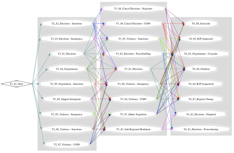
Susan used some sophisticated tools (e.g. GraphViz which produced this image) as a first pass, but mostly, it shows just how complicated the rules are.
With a bit of time here and there, I was interested in finding a better solution. All the more because it seems like we might have more projects like this. There are still a couple ideas not-yet-implemented, but one that I think puts a little order to the madness is described below (If you're still reading, that is!)
The idea is inspired by Karnaugh maps -which generally handle binary data Truth table data in two dimensions instead of the one long list of combinations, so it's easier to see some rules.
XKCD has covered karnaugh maps a couple times
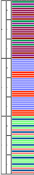
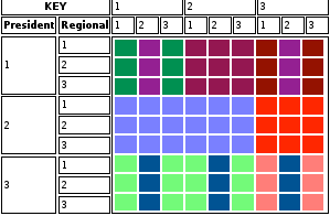
The disadvantage is it takes a little longer to explain! Karnaugh maps have binary possibilities for each input. We have three possibilities for each of the four players. The real way to think of it is instead of an 81×1 list of rows we make it a 9×9 grid with two players on each side.
Each of the roles have three choices. Here we see where to look for each role for their influence.
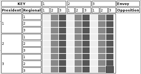
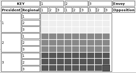
Here are two examples presenting a single state's combinations in the two ways. There is a different color for each resulting state. First here's an example where the rules are moderately simple:
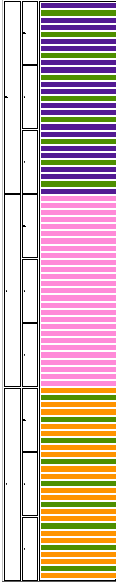
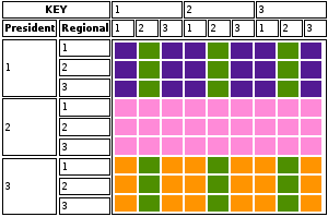
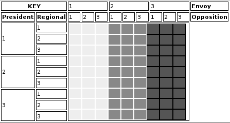
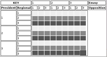
At first it feels like, despite being a little more verbose, we can get the same understanding from looking at the linear version. Here's a more complicated set of rules. In the long version, you have to take an extra step of grouping the separated colors to figure out the rule.
It takes a bit of practice, before one can start seeing and understanding the 'rules' that these maps are explaining. We need to keep the full representation under wraps, so students don't use it to cheat. You can get the idea though, by examining this fake state sequence:

The easiest way to get a sense of what it all means is to try and verbalize what the rules mean. For example, in Turn X, from the state 'Mediation,' the TO grid shows thick horizontal bars. If we look to the KEY, the first two horizontal rows correspond to president decisions. Thus, we can start to tell the story from here that the major outcomes depend on the president's decision. The thin vertical horizontal bars in the bottom row (again by the KEY) correspond to the Opposition Leader's choice. Thus, we can tell the story that when the President chooses (3), the Opposition Leader can change the outcome. Besides that, from the 'Mediation' state, no other player can influence the outcome.
Work still to be done, should we decide this is a good direction, would be:
1. Make it more intuitive through interactive links. On mouse overs we can see what the choices are, and highlight the state in the next turn.
2. We could make this an authoring environment. However difficult, it should be easier than manually entering 1620 rows!
3. Another direction I'm still thinking about is a waterfall-cascade view which may be explained or shown in another post.

