Chapter 3: Insights in lines and dots |
|
[1:] "Look at these two plots! ALL the red quasars are at low z -- because they are
so extincted we COULDN'T SEE THEM at higher z. It's the tip of a red iceberg!"
|
|
[2:] Every morning I am confronted with at least 75 emails. A large fraction of these
are either real-world spam, Columbia spam, astronomical spam, or messages
indicating I have to do something difficult or irritating, the latter being even
less welcome than the spam. But the message above was from my longtime
collaborator Rick White from the Hubble Space Telescope Science Institute, and
his emails are always worth reading. The CAPS and !'s, however, were most unusual;
Rick is from Tennessee (pronounced Tinnuhsea, stretched out over about 4 seconds)
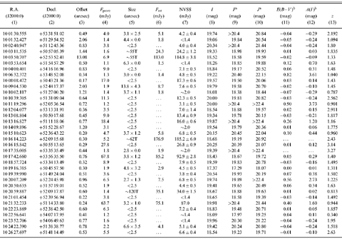
and he generally eschews exclamation points. I quickly opened the following table
of numbers accompanied by two plots:
Figure 1: Quasars discovered by obtaining optical spectra of
all radio sources with stellar counterparts in a piece of sky imaged with a
very red filter on the camera.
|
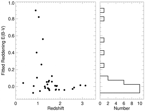
Figure 2: A scatterplot (see para #38) showing the amount by which the
quasar light has
been made to appear redder owing to intervening dust (see para #7) vs. the
redshift, or distance to the quasar. On the right is a histogram (see para #35)
of the number of quasars vs. reddening (E(B-V)).
|
[3:] It was immediately apparent to me that the exclamation points were warranted.
|
|
[4:] Quasars are fascinating objects that generate the energy of a thousand
trillion suns in a space no larger than the Solar System. The engine driving
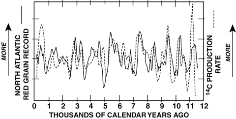
this enormous energy production is a supermassive black hole which has
swallowed a billion stars and now lurks in the heart of a galaxy, ripping
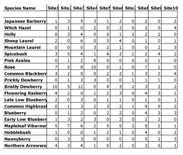
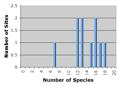
apart any star that wanders too close and sucking up its gas. The black hole
itself is...well, black. But as the gas rushes toward its doom, it is heated
to very high temperatures and glows brightly.
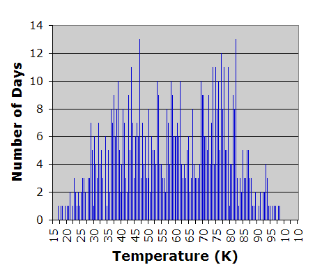
|
|
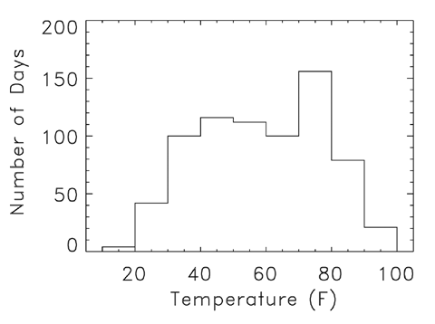
[5:] Quasars were discovered in the early 1960s as blue, star-like objects
coincident with powerful sources of cosmic radio emission. At first
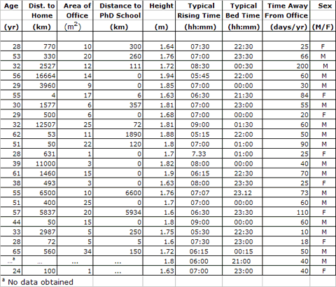
astronomers were extremely puzzled, since an analysis of the quasar light
showed signatures of elements apparently unlike any seen on Earth. Then, in
one of those why-didn't-I-think-of-that-before moments, Maarten Schmidt at
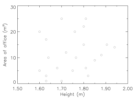
Caltech realized the signature was in fact that of the most common element
of all -- hydrogen -- but shifted to the red in such a way as to imply that
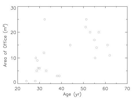
the object was rushing away from Earth at 13% the speed of light. Quasars
were not stars at all, but the most distant objects yet observed whose
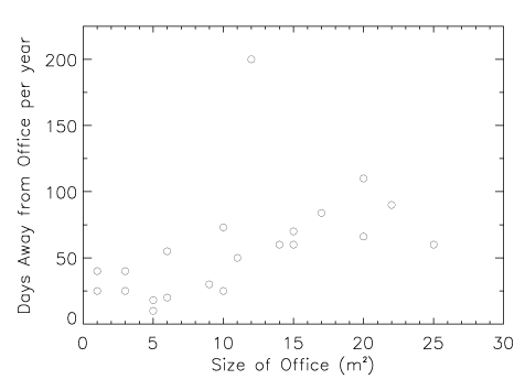
apparent flight from Earth was simply a result of the overall expansion of
the Universe. The enormous distance inferred from this first "redshift" (the
"z" in Rick's note) implied that the quasar had to be intrinsically very
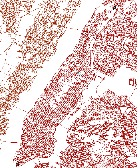
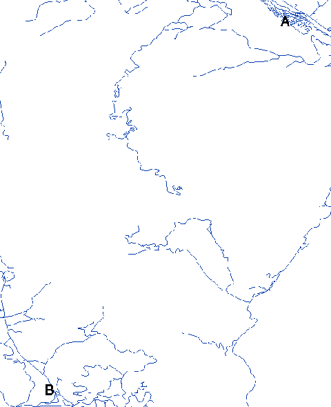
luminous, outshining the combined light of the hundreds of billions of stars
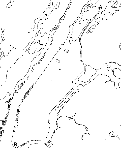
in its host galaxy. Today we have found quasars rushing away at up to 96%
the speed of light, marking them as among the most distant objects seen.
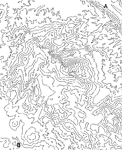
They provide us with a wealth information about what the Universe was like
when it was only 4% its present age.
|
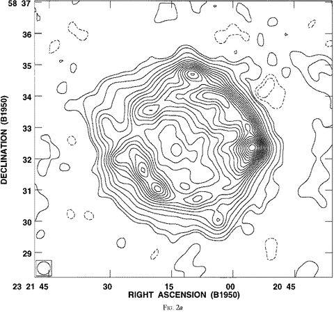
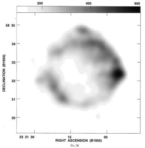
|
[6:] As noted above, the first quasars found were very blue in color, and
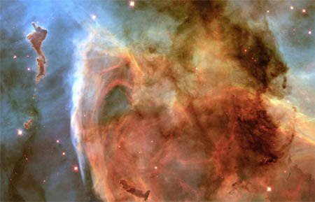
most searches for additional sources have focused on selecting the bluest
objects from among the millions of star-like points of light that dot the
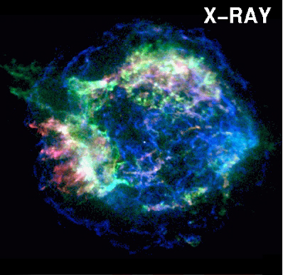
nightime sky. These searches have found many more blue quasars -- the
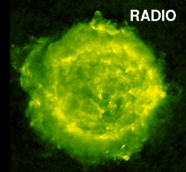
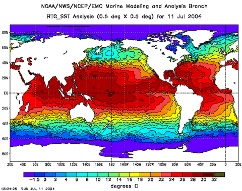
current catalog is approaching 100,000 entries.
|
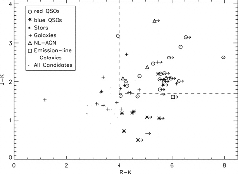
|
[7:] We had been working on our own search for four years -- not because it
was hard, but because it was relatively boring.
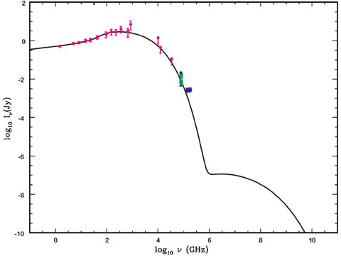
Finding a few dozen more quasars when 100,000 are known was just not the
most exciting project we had underway. The one potentially interesting
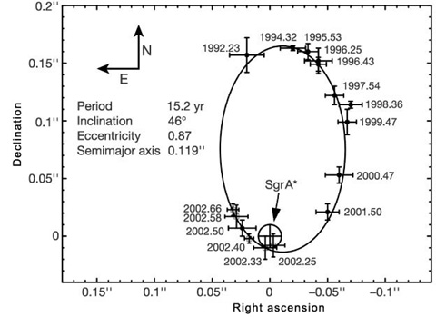
aspect of our search was that, rather than looking for blue objects, we were
looking for red ones which distinguished themselves from normal stars by
being bright sources of radio emission (just like Maarten Schmidt's original
quasar). Our contrarian approach was designed to see if prior workers had
missed out on a putative population of red quasars because of the blue bias
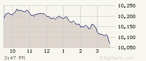
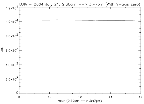
in their selection technique (see Chapter 7 on "selection effects"). In
compiling the table of our findings, it was clear we had indeed found some
very red quasars which appeared to have had their blue light filtered out by
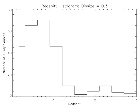
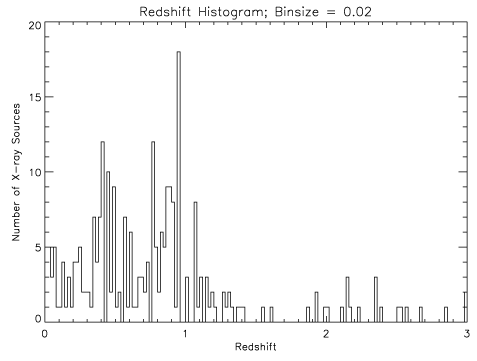
clouds of dust in their host galaxies (much as the Sun gets redder near
sunset when its light passes through more and more of the Earth's dusty
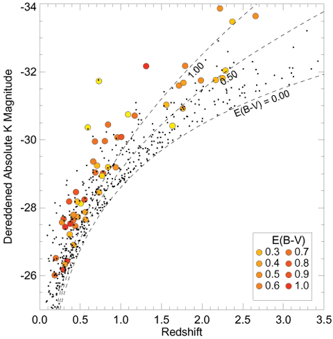
atmosphere).
|
|
[8:] We wrote up the results of our survey,
included the table above, and sent it off to the Astrophysical Journal to
be refereed. After receiving the referee's comments, we were
preparing to submit a revised version when Rick was inspired to make the plot
shown above.
|
|
[9:] The discovery this plot made clear was significant: not only had we found some
unusually red quasars, but the five reddest were also the five most luminous
objects -- these previously overlooked red quasars were putting out more energy
each second than "normal" blue ones were. In addition, the five
reddest were among the quasars closest to us. This combination of properties
meant that we had uncovered the tip of a red quasar iceberg -- that forty years
after quasars had been discovered as distant blue objects, we were realizing that astronomers had missed a huge portion of the population. The
graphs made this immediately apparent. Look here for more details on this result.
|
|
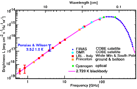
[10:] To a scientist, a graph can generate great excitement. I once saw
2000 astronomers rise for a standing ovation when the following graph flashed on
the screen:
|
|
[11:] This graph represents the first results from a satellite designed to take the temperature
of the Universe -- literally. The Cosmic Background Explorer (COBE, pronounced
CO-BEE) had exquisitely sensitive instruments tuned to measure the faint
afterglow radiation from the Big Bang. When the Universe was born 13.7 billion
years ago, it was a very hot place -- billions of degrees. It has been
expanding and cooling ever since, and the radiation from this initial
fireball has now dropped to a temperature only 2.7 degrees above absolute
zero. Since the Universe was quite smooth and uniform at the time of the
Big Bang, we can use our basic model of radiation to calculate how much of each
wavelength of infrared light and radio waves we should expect.
|
|
[12:] The graph shows the COBE measurements (dark blue diamonds labeled FIRAS and light
blue circles labeled DMR) superposed on the predicted curve and earlier ground-based
measurements. The match is extraordinarily good. The fact that these data allow us to measure
the temperature today to an accuracy of one thousandth of a degree and the fact
that our model for radiation, concocted to explain results in the laboratory, fits
so beautifully the light from the Universe's birth, provoked the ovation
when this graph was shown at the Washington meeting of the American Astronomical
Society in 1994.
|
|
[13:] The notion that 2000 scientists would give a standing ovation to a
graph is not prima facie evidence that we scientists represent an alien species. It is, rather, intimately
linked to the evolution of our common species homo sapiens sapiens and
the complex circuitry in the eye and brain that developed to assure our
success in very different times.
|
|
[14:] A fundamental drive of all individuals and species is survival: to find
enough food to eat and to avoid becoming food for someone else.
The greater the distance at which one can detect tasty morsels and
locate potential predators, the higher one's probability of survival. The
vertebrate eye, with its connection to the brain, is one of the remarkable
organs evolution has produced to allow long-distance observations [here's a paper about the eye's evolution]. Over the past several hundred million years, the eye has been tuned to detect the
most abundant wavelengths of light on Earth [HUH?] and
to preprocess the huge amount of information coming in each second as this
radiation bounces off everything around us, allowing the brain to form a
coherent picture of the environment and direct our actions. One of the more
valuable eye-brain processing systems allows for the rapid recognition of
patterns.
|
|
[15:] If you wish to pass on your genes to successive generations, it has, through
most of human history, been essential that you spot lions, leopards, tigers
and tarantualas before they spot you. The ability to quickly, indeed
unconsciously, recognize patterns of spots and stripes is a valuable survival
tool. The mammalian eye connects to well-adapted preprocessors in the brain that are
especially sensitive to straight lines and edges in particular
orientations; more sophisticated pattern recognition systems operate in other
parts of the brain. These systems have been humming along for several
hundred thousand years in their current form. Numbers, on the other hand, have
only been part of human culture for 5,000 years, a relatively short timescale
compared with our rate of evolution. It is unsurprising that, confronted
with the table of numbers shown above, we failed to recognize the striking
result present in our data, while within seconds of printing out the
simple plots Rick had prepared, I was hammering out an excited email
discussing our new result.
|
|
[16:] This is not to suggest that numbers are not often the most effective
way to present and digest some kinds of information. Representing the batting
averages of the top ten players in the American League as a bar graph would not convey as much information, as crisply, as would a simple table of numbers
[take a look]. Plotting the proportion of ingredients in my secret recipe for chocolate mousse as a pie chart would likely keep it secret;
it provides no clue as to the order in which the ingredients should be assembled or what
intermediate steps must be taken by the mousse-maker.
|
|
[17:] The batting averages already represent partially digested results in that they are computed from
measured data: number of hits / (numbers of times at bat minus number of walks
and sacrifices). Furthermore, there is usually no direct causal connection or
interaction between the values achieved by different players (unless one happens
to bat ahead of, or behind, Barry Bonds). The bar graph of batting
averages conveys no new information and reveals no emergent patterns. Likewise,
the recipe is simply a prescription of enumerated ingredients. While there is
undoubtedly some deep chemical reason why the proportion of chocolate, butter,
bitter coffee, and sugar must be in the ratios specified for my mousse to
achieve its intense flavor and velvety texture, the intermolecular interactions
are unlikely to be illuminated by the pie chart.
|
|
[18:] Whether 'tis nobler to graph, or not, thus requires judgement. But if the
dataset is small and/or the numbers representing measurements are in a computer
with an easy-to-use graphing program, it can't hurt to plot the data. Indeed,
when faced with a large dataset in which each object of interest is
characterized by several parameters, it is not uncommon for a scientist to just
"plot everything against everything else" -- to generate a large
number of plots that represent the parameters of the dataset in different
ways to help us look for the patterns we are so adept at seeing. This apparently
injudicious approach must be accompanied by a constant awareness that
|
|
[19:] 1) we are so good at seeing patterns, we often see them where none exist
[take a look], and
|
|
[20:] 2) the existence of a real pattern in a plot of variable A vs. variable B does
not necessarily signify that A controls B or that B controls A.
|
|
[21:] Chapter 6 expands on this latter notion.
|
TYPES OF GRAPHS |
the time series |
|
[22:] The raw materials for making a graph are data
(observations or measurements of a physical, biological, or social system), or
numbers (usually generated by a computer) that represent the predictions of a
mathematical model (for more on models and data, see Chapter 7). In most
instances, these data are represented in numerical form -- as pairs, triplets,
or longer series of numbers corresponding to some measurable attributes of the
system under study.
|
|
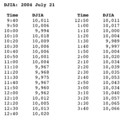
[23:] Take the Dow Jones Industrial Average (DJIA) - a widely followed single
number reputed to be a measure of the strength of the US economy. Each day in
the New York Times and many other papers one can find a record of this average
"minute-by-minute." Whether any profound meaning can be read into such data,
there clearly is a lot of it: the DJIA is quoted to seven significant figures
(of which only three actually contain economic significance) for each of the
420 minutes the stock exchange is open. It is clearly easier to represent
this large collection of numbers in a graph. The display of a quantity
plotted as a function of time, we call a time
series plot. Each measurement of the DJIA comes with a paired number, the time
of the measurement. The series of number pairs looks like this in a Table:
Figure 4: Table of DJIA values every ten minutes on July 21, 2004.
|
|
[24:] and like this in a time-series plot:
Figure 5: Minute-by-minute time series plot of the DJIA on July 21,
2004
|
|
[25:] In most instances, time series plots use the x-, or horizontal, axis as time
and the y-axis as the quantity being measured. It is worth noting that this convention is, mathematically speaking, completely arbitrary.
Furthermore, it is far from universal; e.g., plots representing evolutionary
trees of life almost always have time running up the y-axis [like this].
Speaking English, rather than mathematics, this convention ties the
graph to our normal use of language. We talk about the DJIA going "up" (to
higher numbers) and "down" (to lower numbers), not "left" and "right", even
though exactly the same information is displayed if we switch axes:
Figure 6: The same DJIA graph simply rotated by
90 degrees. There is no reason other
than convention that we could not make the plot this way -- it conveys exactly
the same information.
|
|
[26:] An enterprising young newspaper editor bent on creating a new style for his
paper would thus be mathematically correct to present the stock market averages
in the second form, although his tenure as editor might be short. While
the notion of the stock market increasing in value as it moves to the right
might comport with political labels, our sense of being "pulled" "down" by the
"gravity" of the situation and "soaring" "upwards" to "heaven" all militate
against a change in the convention. A scientific example of the utility of time
series plots is shown here, where, after plotting the morass of
numbers in the database, human impact on the
Earth's atmosphere is frighteningly apparent.
|
|
[27:] It should be added here that both the point of origin we assign to a
graph and the direction in which time increases are equally arbitrary. Indeed,
as discussed below, the zero-point for the y-axis (DJIA value) is often
suppressed, greatly exaggerating the apparent movement (see para #72). The
left-to-right increase of time follows the convention of our
Latin-language-based writing which flows from left to right. It is important to
note, however, that it is not always true that graphs are plotted with the
values increasing upwards and from left to right. This plot shows
a record of the heavy isotope of oxygen, O-18, found in the ice layers of the
Greenland glacier. This isotope is a very good indicator of temperature: more O-18
means higher temperatures, and less means lower temperatures. The isotope fraction
relative to sea water is plotted as a time series over the past 120,000 years.
Note the graph has time running backwards from the zero point (which equals
today). It is always important to read the axes.
|
axes |
|
[28:] In a well-constructed graph, each axis (and there can be more than two) will
have a label, as well as a series of numbers marking the length of the axes
at fixed intervals. The labels should specify both what is being plotted
(in a descriptive English word, phrase, or abbreviation) along with the
units (if any) employed (DJIA is in an arbitrary system of "points", while
time is either in minutes, days, or years depending on the timescale covered
by the data). Note that neither axis need start at zero. The
tick marks and numbers indicating the intervals can be spaced in either a linear
or a logarithmic fashion [here's an example.]
|
|
[29:] In some instances, both the left and right or the top and bottom of
a plot will be utilized -- with different scales and different labels! A
simple example of this might be to provide alternative units so a single
graph can serve multiple audiences. For instance, a car manufacturer might
wish to display the fuel efficiency of a particular model as a function
of driving speed (all cars have a peak efficiency of gas use that falls
off for either higher or lower speeds). For a European audience, this graph
would be presented as the fuel used in kilometers per liter on the left side
(y-axis) vs. the speed in kilometers per hour on the bottom (x-axis); as such,
it would leave the average American driver clueless. To avoid the cost of
having to design and print a new graph for the American market, the
manufacturer could simply print different scales and labels on the right-hand
and top sides of the graph using miles per gallon and miles per hour,
respectively. This might leave out the schizophrenic Brits who now think
in miles per liter for fuel efficiency, but it would provide the required
information for most of the world market.
|
|
[30:] It is also not uncommon to find more than one set of data on a single plot; in
such a case the different axis labels refer to the different curves. For example,
it has been known since Galileo first discovered them that sunspots -- huge
magnetic storms on the sun that appear as dark blotches on its surface -- vary
dramatically in their frequency of occurrence. In addition to a regular
eleven-year cycle of waxing and waning, changes occur on timescales
of centuries and perhaps even longer. Much speculation has centered on whether
or not these spots affect the Earth's climate. The following diagram explores
this possibility by including both the record of red sand grains dropped by
icebergs in the North Atlantic and the rate of radioactive Carbon-14 produced in
the atmosphere, labelling the former on the left-hand vertical
axis and the latter on the right. The extremely good correspondence between the
two curves offers tantalizing evidence that increased solar activity -- which wraps the Earth in a protective magnetic blanket that screens the
atmosphere from radioactivity-producing cosmic rays -- is linked to large
increases in Earth's temperature (see the caption to Figure 7 for a fuller
explanation). When two seemingly unrelated measurements are correlated (see
chapter 6), it suggests that they may both be caused by a third phenomenon
-- in this case, the changing energy output of the Sun.
Plotting the two time series on the same graph makes the relationship
apparent.
Figure 7: The concentration of red sand grains from Canadian soil
(solid curve and
left y-axis) which appear in ocean sediment layers in the North Atlantic vs.
time, from roughly the end of the last ice age to the present. Note that the
time axis runs into the past from 0 (= today). The dotted line (right axis
label) shows the rate at which radioactive Carbon-14 is produced in the Earth's
atmosphere. High enery particles from the far reaches of the Galaxy called cosmic rays
slam into atmospheric Nitrogen atoms and transform them into radioactive
Carbon-14. When the Sun is active, its magnetic field reaches out and
deflects these rays from hitting the Earth, lowering C-14 production.
Simultaneously, the more active Sun warms the Earth, causing icebergs to
melt before the reach the North Atlantic; thus, fewer red grains. When solar
activity wanes, the cosmic rays are back making C-14 and the cooler Earth
allows icebergs from Canadian glaciers to reach more southerly latitudes
where they eventually melt, dropping the embedded red soil grains to the
ocean floor.
|
|
[31:] In summary, while the distribution of points and lines on a graph may visually
convey an immediate sense of pattern, the axis labels hold the key to
interpreting this pattern and the possible meaning that underlies it. So read the axes!
|
the bar chart |
|
[32:] Even simpler than the time series is a frequently used graph dubbed the bar
chart. Like all graphs, the bar chart is simply a way to collect a large
number of data points and represent their content at a glance. It is used when
the measurements of interest have discrete values; e.g., if the possible
outcomes of an experiment or observation include only integers. For example, if
we were to send ten teams of students out to measure the numbers of plants
of various species found at several locations in the City, the basic datum
each team would return with from each location is a single integer -- the number
of species found. Furthermore, these numbers are likely to have a limited
range: there certainly cannot be less than zero species found, and our ecologist
colleagues can tell us the number in any one location is unlikely to exceed 20. The dataset from this
kind of experiment can be well-presented as a bar chart. Thus, we go from
a table of numbers:
Figure 8: Number of Each Species Found at Each Site
|
|
[33:] to this informative display:
Figure 9: Bar Graph: Number of Sites vs Number of Species Found
|
|
[34:] The graph immediately shows that none of the locations chosen was
completely devoid of plant life (no zeros) and that highly diverse sites were rare.
The typical site had 12-16 species, but the range extended from 7 to 18. Comparing this graph to various mathematical functions, such
as the statistical descriptions discussed in Chapter 5, we can characterize
the entire dataset with a few numbers such as the mean, range, and
standard deviation. This compact description is then amenable to
comparison with theoretical models for why plant diversity is distributed as
it is.
|
the histogram |
|
[35:] If our data consist of a set of measurements of some quantity that varies
continuously, it is usually appropriate to create a modified form of the bar
chart called a histogram. Suppose (as I did as a geeky youth) I measured
the temperature every day for two years at precisely 6:30AM (a time you used
to consider morning, but by semester's end will regard as bedtime).
Trying to be a good young scientist, I was careful to measure the value
to the nearest half degree (oblivious to the fact that this was almost
certainly meaningless precision, given that wind speed, humidity, and the
recent rate of temperature change -- all of which affect the measurement --
were not also recorded [WHY?]).
|
|
[36:] At the end of my observations, I had 731
data points [HUH?] ranging from 17.5 F to 99.0 F. Since there were
164 possible
values [HUH?] in this range for me to record, there are at most
a few
values falling at each bar's location; many bars have zero entries, and only two
were higher than twelve. With this large number of possible bars and the
relatively small number of measurements, a bar chart is not very informative:
Figure 10: Bar chart of my temperature data showing the number of
days on which each temperature was recorded.
|
|
[37:] It also misrepresents the physical quantity I was measuring to some degree,
implying that temperatures could only have values of 50.0 or 50.5, for example,
when 50.25 or 50.1897 are equally probable. To acknowledge the approximate
nature of my measurements and to produce a more informative graph, I need simply
to collect the data into "bins" and plot it as a histogram. That is, I add up
the number of measurements between 90 and 100, the number between 80 and 90,
etc. and reduce the 730 numbers to 9 [HUH?] I then draw them as
in the bar chart, but with the bar edges removed, indicating that the
measurements are
continuous, and that there is no sharp break between one bin and the next.
Again, standard statistical measures of the resulting histogram allow an even
more compact description of my observations and facilitate comparisons with
models.
Figure 11: A histogram of the same data, showing the broad trends
more readily.
|
the scatter plot |
|
[38:] One of the most common circumstances in the lab, in the field, or at the
telescope is that one collects measurements resulting in two or more numbers
describing each object of interest, be it an atom, a deer tick, or a star. To provide you with a fascinating statistical portrait of your faculty
in this course, we collected some data describing them:
|
|
[39:] A: Age
B. Number of kilometers from campus to their childhood home
C: The size of their offices in square meters
D: Number of kilometers from campus to their PhD institution
E. Height
F. Typical rising time in the morning
G. Typical bedtime
H. Average Number of days away from campus in a year
I. Sex (M or F, not Yes or No)
|
|
[40:] We then made a table of the results:
Figure 12: Table of All Faculty Data
|
|
[41:] Perusing these ~215 numbers is not likely to reveal any profound truths.
|
|
[42:] But plotting them might. The simplest thing one can do when confronted with
a long table of numbers is to choose one (arbitrarily, say office size) as x and another
(perhaps height) as y and plot a point in this two-dimensional space representing
each individual. The name of this graph -- a scatter plot -- derives from the
common result: the points scatter randomly across the page.
Figure 13: Faculty Height vs Area of Office
|
|
[43:] While one might have thought that, in a rational world, there might be some
relation between the size of an occupant and the size of his or her office,
this graph ratifies a well-known truth: universities are not rational places.
The points are scattered completely randomly over the diagram. Apart from
the total range of heights and office sizes, there is not much to be learned
from this graph.
|
|
[44:] Sometimes, however, a pattern is immediately apparent, such as clumps
of points surrounded by largely blank areas.
Figure 14: Faculty Age vs Area of Office
|
|
[45:] Here we see that, with one exception, all the faculty in this course are
younger than 40 or older than 50. Furthermore, the older ones tend to have
larger offices than the younger ones. You might conclude that a shred of
rationality is creeping in here: the old fogeys may need more time to
nap and therefore need an office big enough for a couch. However, the real
explanation is that the course is staffed with Postdoctoral Fellows and senior
faculty (thus explaining the age split), and the latter get all the perks.
|
|
[46:] An even more informative pattern can be a linear alignment of points across the
graph.
Figure 15: Area of Office vs Days Away from Office per Year
|
|
[47:] Examining this plot, we are likely to say the two quantities are "correlated".
Chapter 6 explores the analysis of such correlations in detail. In this case,
again with one exception, there is a clear relation between office size and the
fraction of time the office is occupied; in classically irrational fashion, the
more one is away from campus, the bigger an office one gets.
|
adding dimensions: the contour plot |
|
[48:] While the sheet of paper on which a graph is drawn is a
two-dimensional surface, our data collection need not be limited to only two
numbers representing each object. When three or more numbers comprise each
data point, it is necessary to develop additional dimensions for our
graphical representations. Perhaps the most familiar of these is the
contour plot.
|
|
[49:] If you are about to set off on a hike in unfamiliar territory, it is unwise to
use a standard two-dimensional map to estimate how long it will take to get from
point A to point B. A map does, of course, come with a scale that you can use
to convert inches to miles (or, preferably, centimeters to kilometers) and determine the "distance" between the two points. But walking the twelve miles
from the Broadway bridge (A) to Battery Park (B):
Figure 16: Street map of Manhattan and the surrounding area. The scale is 1cm =
1km.
|
|
[50:] and the twelve miles from Mountain Road in Cascade (A) to Lazy S Ranch Road in
Independence, Colorado (B):
Figure 17: Street map around Independence, Colorado. The scale is also 1cm = 1km
but the road density in this neighborhood is clearly much lower than in
Manhattan.
|
|
[51:] are very different experiences. The surface of the Earth is three-dimensional, and the number of steps you take (and the number
of Power Bars required) will depend not only on the 2-D map distance, but on the
changes in elevation you must traverse. To provide this third dimension, we
often use a contour plot.
|
|
[52:] Each point along the route can be represented by its position in a
three-dimensional space. Your origin is at a particular longitude, latitude,
and elevation above sea level; your endpoint likewise requires three
coordinates to represent its position, as does every point in between. In
order to display this third dimension (elevation) on the 2-D surface, we
draw lines connecting nearby points with the same value in that parameter;
e.g., points 100 meters above sea level will be connected with a line until it either makes a continuous closed loop or gets to the end of the page. Points 200 meters high are then linked by a separate line, etc.
The results for the two maps illustrated above are as follows:
Figure 18: Contour map of Manhattan with contours every 40 meters
Figure 19: Contour map of Pike's Peak in Colorado with contours
every 100 meters
|
|
[53:] Clearly the two maps reveal a very different picture of how your day will
unfold. In Manhattan, the trek will be nearly two-dimensional; only
Washington Heights at the north end of Manhattan and (barely) Morningside
Heights below it represent some steps expended going up and down instead of
forward. In Colorado, however, the route charted -- while the same number of
inches on the map or miles across the surface of the globe -- will require the
ascent and descent of a 14,000 foot peak from a starting altitude of 9,000
feet -- that's almost one mile up and one mile down, or two extra miles (assuming
you could actually walk in a line as straight as that of the Manhattan street
grid).
|
|
[54:] Contour lines provide a vivid representation of the third dimension once
you train your brain to recognize what they mean. Elevation lines
squeezed tightly together mean that the elevation is changing rapidly
(translation: a very steep route to be avoided). Jagged lines mean frequent
changes in elevation (up and down, up and down); paths along which elevation
line values (typically labelled at intervals along each line) constantly
decrease is where you get to relax (going down hill) -- unless they are very
close together, in which case falling down hill may be the uncomfortable result.
|
|
[55:] Contour lines need not, of course, only represent elevation on a map. They
can be used to illustrate the third dimension of any dataset in which each
point is described by three measurements; e.g., the radiowave brightness of an exploded star's remnant on the sky.
Figure 20: A radio image of the sky at the location of a titanic
stellar explosion
that blew apart a massive star in the year 1665. The x- and y-axes represent
position on the sky, and the contour lines represent radio brightness; the
"peaks" here are over 100 times brighter than the map average.
|
adding dimensions: color, greyscale, and symbols |
|
[56:] While the eye is good at picking out continuous lines, rendering the contour
plot a useful method for representing a third dimension, it is also adept at
sensing color, shading, and shapes; these alternate visual cues can be
used to increase dimensionality on a two-dimensional graph.
|
|
[57:] A "true-color" image is one in which we are really seeing a representation of
light from the visible portion of the spectrum as we do on color film or in
this remarkable digital image from the Hubble Space Telescope.
Figure 21: The Keyhole Nebula as imaged by the Hubble Space
Telescope Wide Field Camera in 1999. This region of sky was imaged through six
separate filters of different
colors that were then combined to produce this true color image of a region
in the southern skies where new stars are forming out of clouds of gas and dust.
The region lies about 8,000 light years from Earth.
|
|
[58:] You might think of this as a "picture" rather than a "graph"; but it is actually
a computer-generated image that represents two dimensions on the sky (the x-
and y-axes), the wavelengths of visible light recorded at each point as a color
(red is long-wavelength, blue is short [see Beethoven's Symphony]), and a fourth
dimension of brightness -- the color is intense where there is a lot of light
emerging and dim where there is little.
|
|
[59:] In some images, color can stand in for other wavelengths. Thus, even if we
make a map of the sky in a wavelength our eyes could never see, such as the X-ray
image below, we can assign red to the long-wavelength, low-energy X-rays, yellow
to shorter ones, and green and blue to shorter wavelengths still. The result is
an image in which we see where (in two-dimensions on the sky) the
hot (short wavelength) and cool (long wavelength) gas from this exploded star
resides, information of great value in building models of the explosion and its
subsequent evolution. This use of color is called "pseudocolor" -- red is not
actually red but stands, as it does in the visible part of the spectrum,
for the longest wavelength radiation.
Figure 22:
An image of the location of the star that exploded in 1665 from Figure 20, but this time seen in X-rays by the orbiting Chandra Observatory
X-ray Telescope. The X-rays of different wavelengths have been color-coded
such that red corresponds to long-wavelength (low-energy) X-rays, green to
intermediate X-rays, and blue to short-wavelength, high-energy X-rays. By allowing astronomers to see where the warmer and cooler gas is, this
pseudocolor image helps in modeling the explosion.
|
|
[60:] Color can be used to represent some completely different quantity
such as brightness or temperature. Such images are called "false-color" images
and require an explicit key for mapping color to the quantity it represents.
Figure 23:
Yet another version of the exploded-star remnant. In this radio image, color
stands for intensity or brightness, with the green areas being less intense and
the yellow areas brighter.
Figure 24:
Ocean surface temperature over the whole globe as measured by a
satellite on July 11, 2004. The color scale at the bottom shows how to translate
each hue to temperature. While there is an obvious gradient from warm to cool
when going from the equator to the poles, the effect of large-scale ocean
currents is apparent -- the color bands are far from uniform and parallel to
the equator.
|
|
[61:] Since color printing is still fairly expensive, a practical alternative is
offered by the greyscale plot. Again, the shades of grey can represent any
parameter as long as a scale is given. As an example, we show the greyscale
version of the contour plot of the exploded star.
Figure 25:
A greyscale image of the same data used to make
the contour plot in Figure 20. The shading bar at the top of the image indicates that black areas correspond to bright spots and white areas are dim spots. This reversal of the normal use of white and black is often done to save
ink.
|
|
[62:] Maps and images are not the only graphical displays in which extra dimensions
are required to illustrate the full suite of data available. It is often useful
to display the attributes of different types of objects on the same plot using
different symbols -- dots, triangles, stars, etc. For example, in
following up our apparent discovery that lots of hidden, red quasars were
lurking in the Universe, we set out to uncover ways of finding them efficiently.
First, we went even redder than red, by looking at infrared images of the sky to
find candidates. We then followed up each candidate by taking its spectrum --
breaking up the light into its constituent wavelengths, much as a prism breaks
white light into the colors of the rainbow. Analyzing these spectra can
tell us an object's distance and whether it is a star, a normal galaxy,
or a quasar. We displayed the results in the following plot:
Figure 26: Infrared vs. optical colors for quasar candidates in our
survey. The
results of observations designed to yield distances and source classifications
are illustrated by the different symbols displayed. The box enclosed by the
dashed lines in the upper right identifies a region in which 50% of the
candidates turn out to be our quarry: red quasars.
|
|
[63:] Here the axes represent the quasar "colors" calculated by combining visible
and infrared measurements. The letter J, K, and R represent standard wavelength bands in which astronomers observe. The difference between pairs of bands tells us whether an object is redder or bluer (larger numbers indicate redder). The different symbols represent stars (*),
galaxies (+), red quasars (o), and other denizens of the celestial zoo.
Examination of the distribution of different symbols in the plot allows us to
define a region (the upper right-hand box) in which we have a 50% chance of
finding a red quasar; outside this region, most of the candidates turn out to be
boring stars or galaxies.
|
LIMITS AND UNCERTAINTIES |
|
[64:] The data we collect and wish to represent on a graph is rarely both complete
and infinitely precise. Most measurements include a range of uncertainty
or error (see Chapter 5), and it is important to represent this on our graphs.
Furthermore, we are often unable to obtain all the measurements we want, and
this incompleteness is also essential to display.
|
|
[65:] There are standard conventions for representing both "errors" (uncertainties)
and "limits" on graphs. Each point should have an associated uncertainty in the
measured value of the quantity of interest. In this astronomical "spectrum,"
we plot the amount of radiation the source is emitting vs. the frequency of
light (in this case, radio and infrared waves) emitted.
Figure 27: The radio/infrared spectrum of the 3.6 million solar mass black
hole at the
center of our Milky Way galaxy. The error bars represent 1-sigma uncertainties (Ch 5)
in the measurements. Note that the frequencies at which we take the data are
so precisely specified that the uncertainty is smaller than the width of the dots
and no horizontal error bar is necessary. The continuous line drawn through the
points is a theoretical model of what such a black hole should emit. Note
that the pink point near 3.0 on the x-axis lies above the line, but only
by about 1.5 times the length of its error bar; statistically (Chapter 5) we should expect roughly one
such deviation out of every 10 measurements, so this point is NOT
inconsistent with the model. However the two rightmost blue points are many
standard deviations above the predicted curve and thus indicate a problem
with the model.
|
|
[66:] In this representation, the dot represents the measured value and the vertical
length of each "error bar" illustrates the degree of uncertainty for the point
through which it passes. It is important to specify the convention used in
drawing the length of the bar. It can represent the entire range of measurements, one or two standard deviations (see Chapter 5), the error in the
mean (see Chapter 5), or some other indication of uncertainty; the choice should
be clearly spelled out in the figure caption (an admontion almost universally
ignored in newspapers and all too infrequently followed by scientists).
|
|
[67:] For a scatter plot, measurements can have
uncertainties in both coordinates. In this case, orthogonal error bars can
be plotted on each point. If the number of points is large, and the hundreds
of overlapping error bars would clutter the plot, it is acceptable to
illustrate the "typical" error bars for a few points to give the viewer
an indication of the uncertainties involved.
Figure 28: The positions as a function of time of a star orbiting the
massive black
hole at the Galactic Center. Each point is labelled with the date of the
observation, and the uncertainties in the two coordinates on the sky (Right
Ascension and Declination, the equivalent of longitude and latitude
on Earth) are indicated by horizontal and vertical error bars, respectively.
Sgr A* is the name of the central black hole; its position is indicated by
a circle enclosing a cross which represents its positional uncertainty.
Determination of the parameters of this star's orbit (indicated on the left)
led to an accurate measurement of the black hole's mass.
|
|
[68:] In a bar graph or histogram, each bin can be assigned a vertical error bar.
This is usually based on the number of points in each bar. Since the relevant
statistics for most counting experiments follow the binomial distribution (see
Chapter 5), the error bars are most often displayed as representing some
confidence interval from that distribution (e.g., given the measured value,
there is a 95% chance that the true value lies between the upper and lower
limit of the bar's length) [here's an example.]
|
|
[69:] Data incompleteness can take several forms. A star may simply be too faint for
our instruments to detect, or several patients in a large clinical study may
disappear on a sailing trip around the world, preventing us from obtaining
timely blood samples. In the case of the star, our data
are not useless. They may not tell us the brightness of the star, but if we know
the brightness of the faintest star our telescope could see, the
non-measurement assures us that the star is fainter than this value. This is
known as an "upper limit", and it is important to display such limits on
our graph to avoid misrepresenting the results of our experiment. In the case
of the missing patients, their absence may lead to a "lower limit" being
indicated on our graphical display of the trial: "at least 43 patients responded
positively to the medication" (the 43 measured, plus, perhaps, some of the five
whose measurements are missing).
|
|
[70:] Upper and lower limits are typically represented by arrows pointing in the
appropriate direction: down or to the left for an upper limit, up or to the
right for a lower limit (assuming the axes increase from the origin upwards
and to the right -- remember to read the axes carefully!). In a histogram
or bar chart, little arrows inserted into the bars themselves indicate how many
of the measurements displayed in each bin are actually lower or upper limits.
The black hole spectrum, shown above, shows several upper limits near the x-axis
value of 4.0, all of which are barely consistent with the model prediction. (For another example of a graph with limits, see Figure 26, or look here.)
|
TRICKS AND MISREPRESENTATIONS |
|
[71:] As Chapter 5 notes, statistics have a bad reputation; their misuse, deliberate
or otherwise, can easily mislead the innumerate and confound all but the most
careful scientist. Graphs have a less scurrilous reputation, but they too are
subject to simple manipulations that can convey false or misleading impressions.
|
|
[72:] The simplest trick, often found in newspaper articles, is the suppressed zero.
Consider these two representations of the Dow Jones average time series plots:
Figure 29: The typical newspaper display of the minute-by-minute Dow
Jones Industrials
Average from July 21, 2004; the impression is clearly of a substantial
decline toward the end of the trading session. Note, however, that
the origin on the y-axis is not zero or even close to zero.
Figure 30: The same graph using y=0 as the origin. The huge decline
represented
in the suppressed-zero graph above is now completely inconspicuous, being
smaller than the thickness of the line representing the average.
|
|
[73:] The first graph might be accompanied by a headline "Stocks Plunge on Interest
Rate Worries." The precipitous decline in the curve around 3PM looks ominous
indeed. Would the second plot support the same headline? Could any reasonable
person call the nearly invisible inflection near 3PM a "plunge"? Probably
not, leaving the headline writer bereft of emotionally charged words with which
to describe the day's "market action." These two plots, of course, present
exactly the same data. Which is more "effective"? Which is more accurate?
|
|
[74:] Another behind-the-scenes sort of manipulation to which one must always be alert
applies primarily to bar charts and histograms: judicious binning. The person making the graph controls the
widths and starting point of histogram bins. By trying many different combinations, purely
random statistical fluctuations (Chapter 5) can be made to look like
significant results. The simplest, most straightforward choices are usually
best: starting at zero, using integer bin intervals and equal bin sizes. (For an excellent, more thorough discussion on graphical methods and tricks, you may want to take a look at Edward Tufte's publications.)
|
|
[75:] There are occasions, however, when it is appropriate to experiment a little or
to choose sizes that otherwise might not be optimal. For example, the two graphs
below represent the same distribution of redshifts (= distances) for cosmic
X-ray sources in the deepest map of the X-ray universe ever made [Chandra Deep Field North].
Figure 31: A histogram of the number of X-ray sources vs. their
redshifts which
corresponds directly to their distances from Earth. We use a reasonable binning
scheme starting at zero and use equal bin widths of 0.3 in redshift. It is
clear that most of the objects have redshifts less than or about 1.
Figure 32: The same data plotted with a bin width 15 times smaller.
Note the large, narrow spikes which represent physically clustered galaxies all
at the same distance.
|
|
[76:] The first plot shows a fairly flat distribution
between redshifts 0 and 1, while the second reveals dramatic spikes at 0.4, 0.75,
and, particularly, 0.95 where 18 objects are found at the same
distance (most of the rest of these narrow bins are underpopulated). The
spikes almost certainly represent a real effect -- X-ray galaxies clustering
together at specific distances from Earth. Thus, the second graph conveys
additional information: not only are most X-ray galaxies found between redshifts
0 and 1, they clump together in huge clusters.
|
SO HOW MANY RED QUASARS ARE THERE ANYWAY? |
|
[77:] In summary, I display a graph from the latest paper in our now long-running
series on the discovery of red quasars. Prepared by my graduate student
Ms. Eilat Glikman, it shows the distribution of the dozens of red quasars
we have now found, along with the previously known population. The caption
describes the graph.
Figure 33: Infrared luminosity (energy emitted each second) vs.
redshift (distance)
for quasars in the FIRST radio survey sample. Small dots represent normal
blue quasars discovered using standard techniques. Large, colored dots represent
red quasars discovered by our program using infrared selection which employs
the graph in figure 26. The false color key is in the lower left; increasing
E(B-V) values indicate increasing amounts of dust obscuration. The dotted lines
indicate the limits of our survey for various amounts of obscuration; e.g., no
quasar with a reddening E(B-V) of 0.5 or greater can fall below the dashed
line labeled 0.50 (note that none do, since the black dots all have E(B-V)~0
by dint of the way they were discovered -- as blue quasars). Note that the
most highly reddened quasars are the most luminous (we could not see them unless
they were), and only moderately reddened (yellowish) quasars are visible at large
distances (again, they would be too faint if they were heavily obscured).
|
|
[78:] The axis labels, multiple symbols, lines, and
colors tell a story about enormous black holes lunching on stars in the
privacy of their enshrouding dust. It tells their ages, distances, and the
sizes of their domains. A very large table of numbers, representing hundreds of
hours of work and hundreds of thousands of dollars worth of telescope time,
are succinctly summarized in this plot which also points the way to the next
step in our research. In science, a graph is often worth more than a thousand words.
|