Beyond the Lab Coat: Crafting a Visual Identity for a Public Health Initiative
In crafting a visual identity for The New York City, Long Island, and Lower Tri-County Public Health Training Center (recently described in CCNMTL News), our goal was to design something that could quickly telegraph its mission—to help hard-working public health professionals in New York City as well as Suffolk, Nassau, Westchester, Rockland and Putnam Counties deliver essential services to the communities that they serve. However, with a such big name that represents so much both professionally and geographically, the need for a simple, singular idea behind the identity became essential.
The first challenge was to find a way to visually unite these three, very distinct geographical regions of New York. We felt that the answer was to be found in the use of shapes. The three, hand-shaped, less-than-perfect rectangular boxes—symbolizing all three major service areas of New York in the name—are linked together physically to represent a singular service area, which also creates gestures of an urban yet community-oriented landscape that can be commonly seen across the unique areas of New York that this project serves.
The second challenge was to cut through the clutter of conventional public health imagery. After a search for "public health" images on Google, it seemed that we could find nothing but purely rational ideas—complex diagrams, boring stock photography, and loads of people in lab coats. Where were representations of the emotional motivations behind the public health experts themselves? For this solution, we felt that the answer was to be found in the use of color conventions to represent the motivations and desires of our public health professional audience: orange for their enthusiasm, green for the safety they ultimately provide, and blue for the knowledge that they possess.
Here is the logo that we eventually developed for PHTC:

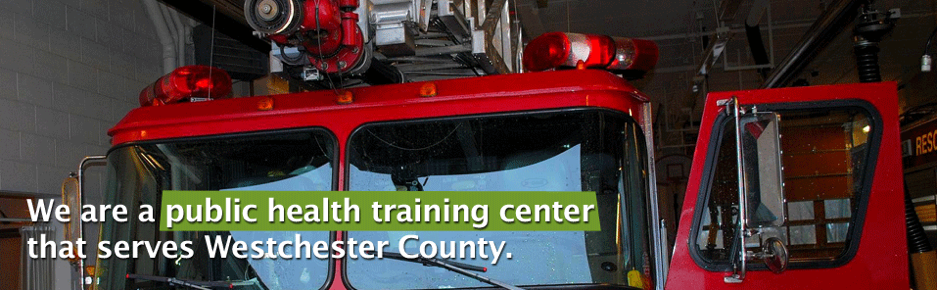
And here are a couple of sample banner images that are being used on the current site:

Hopefully, we now have a unique, appropriate, and human idea about the actual people who practice public health instead of the cold, clinical, and complex imagery that usually tells the story about what they do. The New York City, Long Island, and Lower Tri-County Public Health Training Center is an initiative that provides real-world education and information, values its New York community, and leaves public health professionals feeling empowered and their skills refreshed after interacting with it.
The following images are prototype logos with the final logo at the bottom:
The design evolved, which resulted in the current logo (bottom).
Marc Raymond is CCNMTL's Senior Web Designer.