Some Words On Presentations
In 1973 the Times of London reported that 41 percent of Americans cited "fear of public speaking" as their number one fear. Only 19 percent said they were most fearful of "death." Even if you don't have a mortal fear of public speaking, presenting your ideas in front of large groups of peers or students is a fact of academic life. The arrival of PowerPoint in 1987 made it possible for presenters with basic computer skills to prepare and present slide-based content at conferences and in class.
Presentation software can be a blessing. It can help a speaker organize, plan, and develop a coherent, dynamic presentation. Visual aides such as photographs, diagrams, as well as animations and video can be attractive features, and can shift some of the pressure of public speaking onto the screen.
Yet the software, for all its benefits, also brings with it a number of hidden costs. Pundits like Edward Tufte have argued that software like PowerPoint actually diminishes a presentation's effectiveness because it requires the presenter to break complex ideas down into bullet-point sentences with very few words. On average we speak at a rate of about 130 words per minute, which is more than three times the information that can fit on the average 40-word PowerPoint slide; it might actually be more effective simply to "speak" than to "present." Moreover, the condensed visual material on the screen may distract audiences from working through more complex, lengthy auditory content. Thus the goal may be not to view presentation software as a replacement, but merely as a supplement to oral presentation. Using presentations an aid to your oral presentation of material, ideally as a way to emphasize salient points, will help you develop your own speaking skills, and will ensure that your overall presentation is fluid and dynamic without risking its information density.
Why might you use presentation software
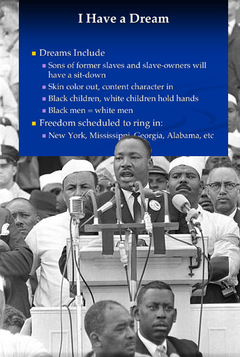
 The most effective, emotional and compelling speeches have been delivered without PowerPoint, but unless your presentation style and choice of topic are as interesting and powerful as the late Dr. Martin Luther King's, an occasional image or some bullet points can really add to your educational presentation.
Additionally, presentation software allows for easy distribution. If you distribute hard or soft copies of your presentation notes beforehand, audience members can annotate by hand or on their laptops. Also, it may be useful for you to annotate the slides during the presentation. Your annotated slides can then also be easily distributed at the end of your presentation.
Some things to keep in mind
When preparing any presentation it is most important to focus on relevant content and your audience -- if you maintain these two foci, everything else will fall into place. Below is a selected list of suggestions:
- Most importantly, do not simply read slides aloud. (focus: audience). Your audience can read faster than you can speak, so this gesture can come across as disrespectful.
- Have good content (focus: content).
- Consider putting provocative questions on the "title" slide rather than your name and the date (focus: audience, content). This technique can engage the audience before the presentation begins and get them thinking about what they know (or don't know) about a subject before your lecture begins.
- Ask the audience questions during the presentation (focus: audience, content). Be sure there is enough time and a legitimate means for the group or an individual to respond.
- Do not plan your presentation in PowerPoint (focus: content). Use outlines, cards, or "mind mapping" techniques instead.
- Remain cognizant of PowerPoint's information density problems (focus: content). Create more in-depth handouts to which the audience can refer during or after the presentation.
- Use Mnemonics (focus: content, audience). Use images to put the audience in a "place" to which they can mentally refer later to retrieve information.
- Occasionally use the "black screen" feature of PowerPoint (focus: audience). If you hit the "b" key during your presentation the screen will go black. This takes attention away from the screen and refocuses it on the speaker (you or an audience member).
- Keep the lights on! Or risk having to hand out pillows (focus: audience).
- Make change (focus: audience). The average attention span begins to wane after about 20 minutes. Occasionally change your presentation style (e.g. ask questions, engage in a small-group task) in order to "reset" audience members' attention clocks.
How to get started
Of course, the suggestions above are entirely non-technical and pertain to any presentation, but a basic knowledge of PowerPoint is required to get started.
There are numerous PowerPoint tutorials on the web:
- http://www.actden.com/pp/
- http://einstein.cs.uri.edu/tutorials/csc101/powerpoint/ppt.html
- http://www.fgcu.edu/support/office2000/ppt/
Here are a couple of specific Power-Pointers:
- Get to know PowerPoint's basic features. Don't worry about slide transitions, background colors, templates, etc. Just familiarize yourself with how to create slides, enter text, resize images, navigate a slideshow.
- Keep it simple. Black text on a light background is best (or vice versa). Color combinations that look great on your desktop computer can look dull and washed out (sometimes to the point of being illegible) when projected.
- Find compelling images. Columbia subscribes to numerous image databases. http://images.google.com is a good source too. Images should be no larger than 1024×768 pixels (otherwise the file size of the presentation can become bloated with large image files).


